DATA VIZ:
AN EXPLORATION

This project was part of the “User-Centered Data Visualization” module for my MSc in Human-Computer Interaction at UCL. The aim of this exploration was to apply data visualization theory to practical use cases. Each design show-cases the thinking behind the visualization choices for time-based data, spatial data, categorical data, hierarchical data, relational data, and network data. To clarify, these designs did not traverse through the entire user-centered design process, but rather a culmination of the module in which I acquired a theoretical understanding of how to best display data to be the most useful for the end-users aka how do we tell a powerful story with data using the tools we have?
Use Case
MSc Interaction Data Visualization Module
Time Constraint
10 Weeks
Role
All - Independent
Tags
exploration, theory, data, visualization
Learning Outcomes
Having successfully completed the module, students will be able to:
Explain fundamental principles of human perception and how they apply to the design of data visualizations or other information displays
Reflect on classic and recent data visualization literature
Apply different methods to visualize data sets
Design effective interactive information displays
Evaluate different information displays across a range of dimensions
Theoretical Foundations
-
Human centred data visualisation becomes increasingly important as data analysis becomes more highly automated with machine learning techniques. However, automatic solutions only work when the algorithms are told how to approach the problem. How to ask the right questions. What to look for. Therefore, having a “human in the loop” is an essential ingredient to building the tools that will use data in a way that is most useful to its users.
-
There are four basic data set types (according to Visualization Analysis and Design by Tamara Muzner) consisting of Tables, Networks & Trees, Fields, and Geometry. These dataset types consist of five core data types items, attributes, links, positions, and grids. An understanding of these data and dataset types allow the designer to have the knowledge of their attributes and constraints. Thus, when designing the visualization within an application or activation, the designer can make the most intuitive and effective choice.
-
Task abstraction opens the designer to breaking down task descriptions “from domain-specific knowledge to abstract form”. This allows the designer to analyse what information the user needs from the data, and what they would want to do with it. Or even what the designer wants the user to do with it. Having an understanding of the action types (analyze, search, query) will impact how the data should be displayed and designed.


Crime Prevention
and Reform
Arrests of children increased in 2022 by 7% compared to the previous year amounting to around 53,000 people. With the urban youth being at risk and disproportionately represented in the criminal justice system, I aimed to design an application that would provide young people with the knowledge to navigate the city safely by informing them of the types of crime incidences within areas of London. I applied my knowledge on data visualization theory to best display data in a way that tells a story and can help users take action.
Categorical + Hierarchical Data
For the following visualizations, I used the the community center data set from the UK Government’s Cultural Infrastructure Map data and the Official UK Police data for reported crimes. The police dataset for reported incidents is an immensely large dataset holding every single crime that is reported. I filtered for the Metropolitan police force and joined the data from collected between February 2022 to February 2023 to narrow the scope for the purposes of this use case. These graphs were processed in Tableau.
Domain Tasks
Which boroughs have the highest incidents of x type crime?
How many incidences of x type crime occur in borough y?
Which boroughs should I avoid to reduce risk of encountering


Time-Series Data :
Another important aspect of the justice system is the conditions of the prisons. There has been some evidence, albeit inconclusive, that better prison conditions may have a rehabilitative effect, thus reducing recidivism rates.
I believe understanding quality of life during imprisonment is important in improving the justice system. I extracted the number of deaths while in detainment —from the UK government prison performance dataset—as a proxy for quality of prison conditions. I used python and the Python Seaborn library to visualise this data as a time-series. It is evident that this time-based line graph shown below contains way too many discrete time points to be useful information for those viewing this. It provides a general overview but the interactive elements integrated into the interface (right) allow the user to pan and zoom without losing context. The yellow timeline above shows the range that is being shown and situates the user within the larger timeframe.


A few other data visualizations, in the context of media and entertainment.

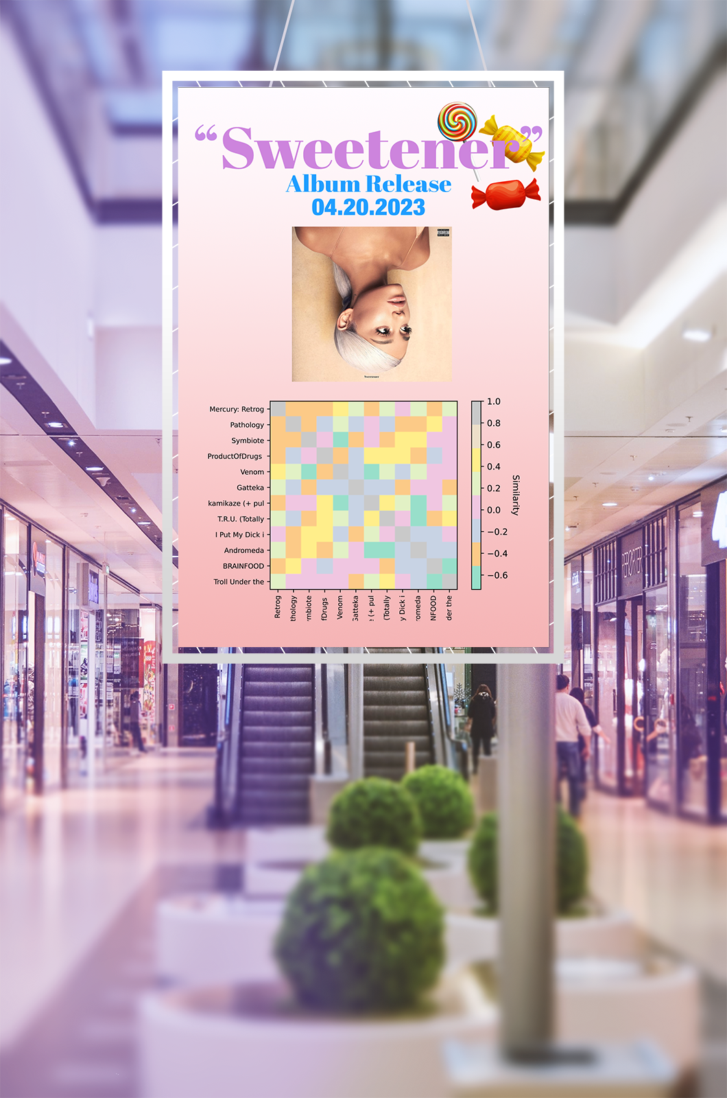
Relational Data: Song Similarity
I used the Songs in Spotify dataset containing songs and and their metadata on attributes such as danceability, energy, and acousticness. I then referred to several tutorials to determine how to create a similaritymatrix using Python. I eventually landed on leveraging the scikit-learn library to extract the pairwise similarity using a cosine metric. I used these similarity values to create a heatmap to show the relationship between two songs, usingthe Python Seaborn library to plot the graph.
Heatmaps are a great way to identify similarity. I chose a monochromatic light-dark green gradient scale. This decision was informed by both Spotify’s brand palette and Light & Bartlein’s proposal on using hue as an identity channel in data visualizations. Although Light & Bartlein discuss hue in relation to maps, heatmaps also rely heavily on color distinction to relay information,which led me to choose a monochromatic, intuitive color palette with dark green indicating a similarity of 1 (identical) and white indicating a similarity of 0 (completely dissimilar).
I faced the challenge of displaying the song names as axes labels. I added a truncate function to address this issue, but it may present the user with readability issues. Furthermore, Spotify allows more than 10,000 songs in a playlist— this would prove to be a huge issue in visualising the heatmap. Therefore, future work should look into having a filter function that will allow you to select the top 15 most similar, least similar, and random select.
I would display this visualization embedded within Spotify’s Desktop interface. This heatmap would require processing power and space if implemented, making it unideal for mobile use. Therefore, as a designer it is important to consider that 52% of Spotify’s streaming happens on a mobile device— however it is still a visualization that can be enjoyed and consumed by users. One potential solution is to display the heatmaps for individual albums (which rarely contain more than 12 tracks) and/or use them as an interactive public display at an album release activation.
Network Data
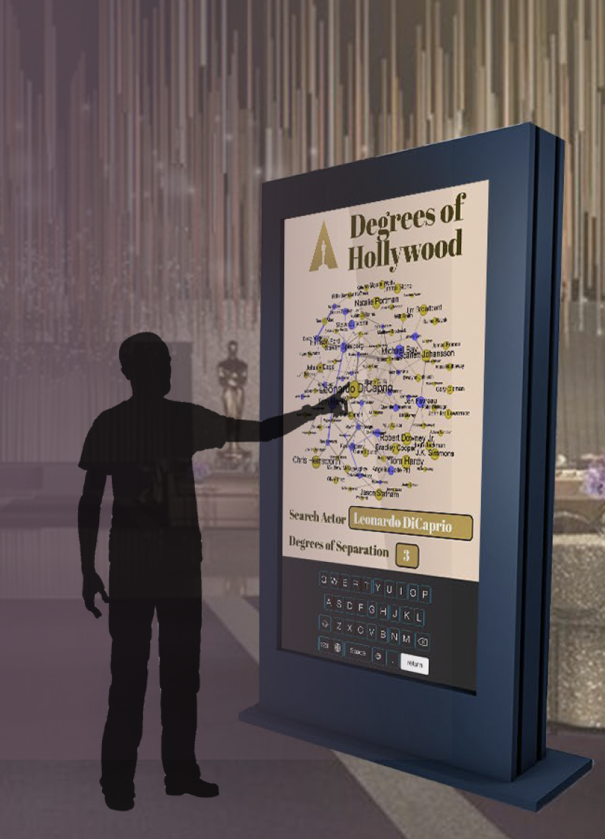
Networks are a discrete datatype used to visualise the relationship (link) between two or more items (nodes), making them ideal ways to display social networks defining the “degrees of separation” between two people. Hollywood is tightly knit social network in which the top actors and directors intermingle often, with several clusters of actors who are frequently casted together or by a particular director.
A paper investigating the core/periphery theory of creativity postulates that successful people in Hollywood (determined by their accolades) often have a core positioning, maintaining industry credibility, while still connected to the periphery, gaining fresh insights [4]. Although this paper builds on network theory as a way to analyse the social influence on creativity, it does not provide a visual representation of this concept. Therefore, I decided to create a visualization that would publicly display at the Oscars, one of the most highly renowned awards of the industry.
Intended users of the interactive public display: The Oscars attendees
Domain Tasks
How connected is person X?
How many people is person X linked to with a degree of separation of n?
Does director X only cast actors who are highly grossing?
Reflections
— Musing N°1
Data is only useful to the lay person if it can tell a story. One of the best storytellers throughout history is through the eyes in the form of visualizations. With data becoming the modern day currency, people are demanding transparency and agency via their data on apps and websites. Data is science. Learning how to tell a beautiful tale with this data, that is art.
— Musing N°2
There are so many ways that data can be displayed and can cause large biases if displayed in one form or another. With data become increasingly important in today’s world state, having public data displays and understand how users interact with data is essentail to understand.